IELTS Writing Task 1 - Two Pie Charts - Topic: Environment
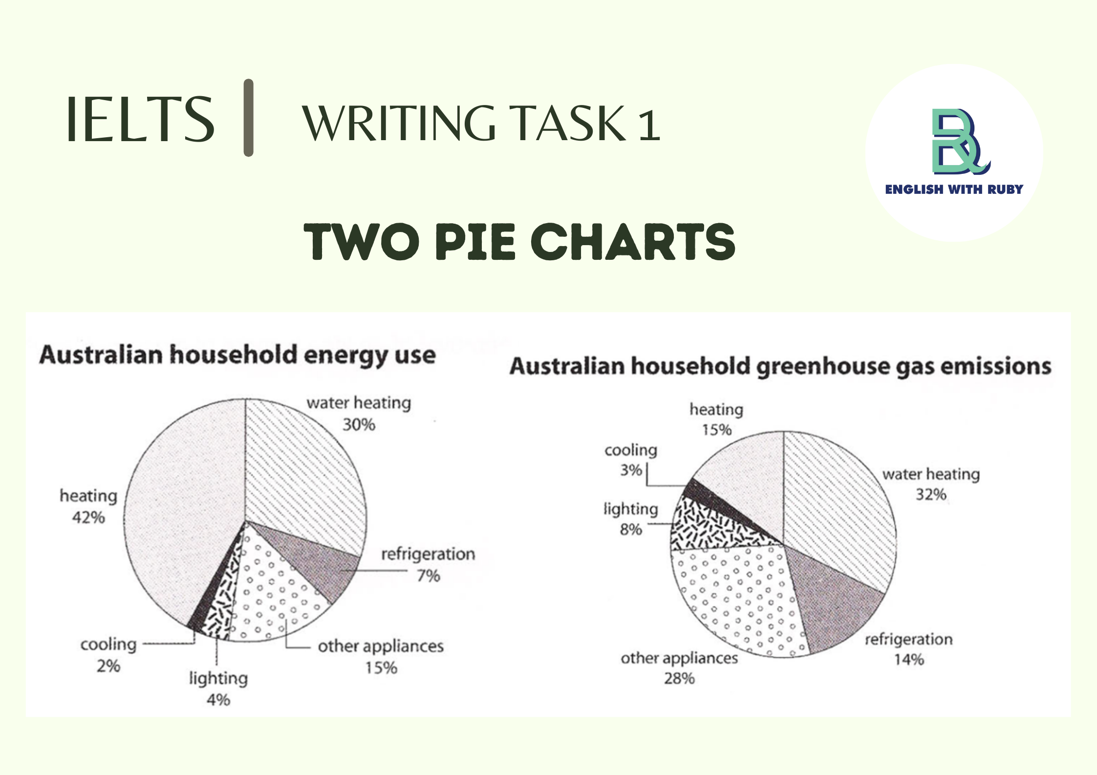
The first chart below shows how energy is used in an average Australian household. The second chart shows the percentage of greenhouse gas emissions which result from this energy use.
Summarise the information by selecting and reporting the main features, and make comparisons where relevant.
The first pie chart displays the usage level of six energy categories in a typical Australian household; whereas the second one illustrates the amount of greenhouse gas emitted from each category. In general, heating dominates as the most essential energy for Australian residents, yet its emission effect is not as significant as other energy types. By contrast, the least popular energy types – lighting and refrigeration, are responsible for a considerable amount of greenhouse gas emission.
In particular, heating and water heating are the most domestically used energy, which account for 42% and 30% respectively. Nonetheless, the proportion of greenhouse gas exhausted by heating (15%) is only a half of that from water heating (32%). Cooling is ranked at the bottom in terms of both energy use (2%) and greenhouse gas emissions’ impact (3%).
On the other hand, despite being utilized minimally by the Australian, refrigeration, lighting and other appliances’ carbon footprint is enormous. The ratio between energy use and gas emissions of these three categories is consistently 1:2. Specifically, refrigeration accounts for only 7% of total usage, but 14% of greenhouse gas emissions is resulted from it. Likewise, lighting’s utilization is insignificant, at 4%, yet they contribute 8% of total emissions.


